Line charts plot your data set as a series of data points connected by straight lines, along Cartesian coordinates. Line charts are commonly used to plot trends over time, but are useful in other scenarios as well.
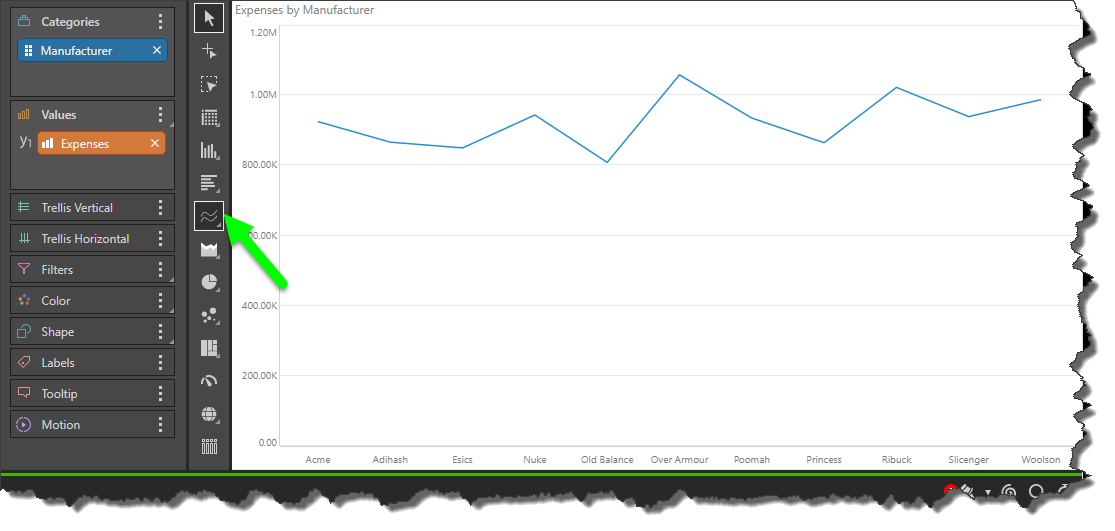
- On the ribbon, click the Components tab to see Chart Design.
How to Build a Line Chart
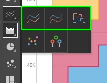
Select a line chart from the Line Chart sub-menu:
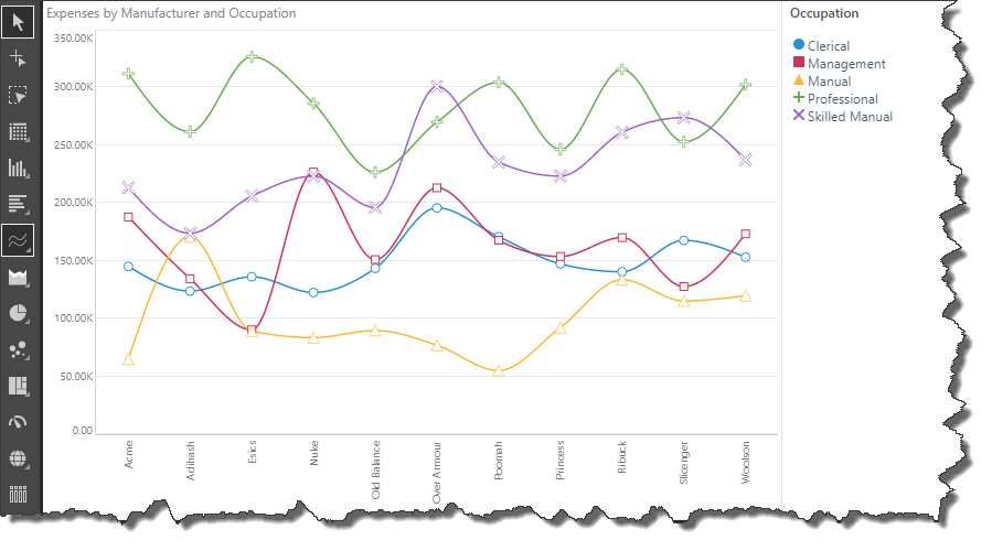
To build a line chart, you must have at least 1 measure in the Values zone and 1 hierarchy in the Categories zone. This will produce a basic line chart, plotting the data points representing the value for each hierarchy element.
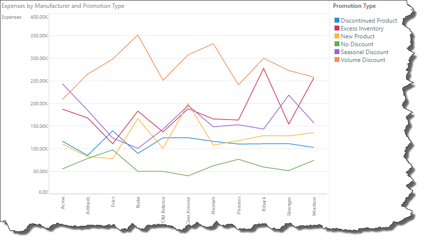
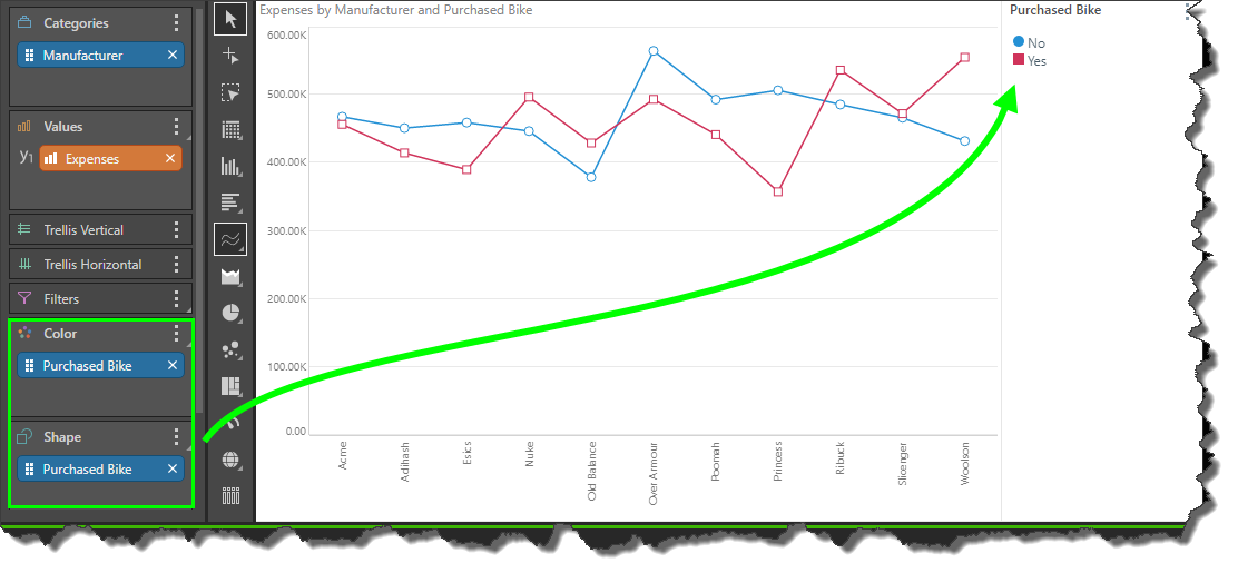
You can plot multiple hierarchies in your line chart by adding a second hierarchy to the Color or Shape zones. In this example, a second hierarchy was added to both Color and Shape, producing a combined color/ shape legend, and data points were enabled.
Spline Chart
The spline chart is identical to the line chart in terms of functionality. The difference between the two is cosmetic, with the spline chart connected each data point with a curved line, rather than a straight line.
Stepped Line Chart
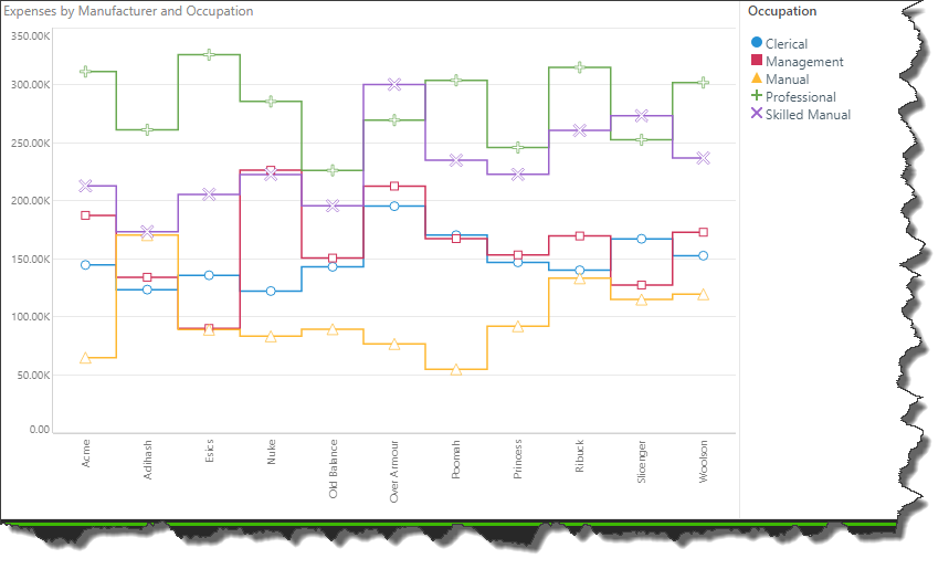
The stepped line chart is another variation on the line chart. The difference here is that the data points are connected by 'steps' rather than a straight line. This can make it easier to read the chart accurately.
The stepped line resembles the shape of a column chart, with a straight horizontal line through each data point, and a straight vertical line between each hierarchy member.